AHEIDEMANART.com
  • home
  • Ceramics
    • Ceramics daily blog >
      • ceramics clean up
    • Projects assigned >
      • project progress scales
    • ceramic videos >
      • video demos
      • Aheidemanart on youtube
    • Ceramics documents..
    • ceramics rubrics & scales
    • hand project still demos
  • 2D art
    • Drawing and painting blog
    • 2d class documents
    • drawing & painting tutorials
    • rubrics
    • 2-Dimensional scales
    • 2d assignments
    • extra credit in 2D
  • File Cabinet
    • philosophy of education
    • Course content
    • art elements
    • rules >
      • rules of the road
      • the fine print
      • Classroom covenant
    • Grading >
      • Work Log
      • project sheet
      • writing a paragraph
      • end of quarter self - evaluation
      • end of the SEMESTER evaluation
      • presentations learning targets
      • clean up ticket
    • Teamwork >
      • employablitity skills grading worksheet
    • scheduals >
      • bell scheudal
      • FINALS SCHEDUAL
      • afternoon assembly schedual
      • confrence shedual
    • substitute teacher info
    • what is ms. h like, anyway?
    • how to make a weebly site
  • Links
    • contact page
    • student blogs
    • advanced & AP 2013-14
    • link to model advanced page
    • link to 'vintage' site
  • Galleries
    • 2D gallery
    • Ceramics
    • Advanced ceramics
    • RAKU!
  • AP student info
  • tutorials
  • Ann talks
  • events!! Blog
  • festival of the arts entry form
  • ceramics club page
  • 2d gallery
  • 2 d gallery blog
  • scheduals
  • parent events
  • New Page

When we get back...

12/20/2017


We have 9 more class days.

our final is on Tuesday Jan 9. We will do at least one more painting when we get back, the final will be a presentation and notes as well as your packet.

After that we will do a colored pencil project - a mandala - and clean up!

Making your own Disney/Earle painting.

12/18/2017


 next assignment - Making your own Disney/Earle painting -- note - these have a 'retro' sixties mood. :)

to  make your next picture you need to work from a photo and create your own Disney landscape. Look at Evynid Earle for inspiration. You can re-work one of his pairings if you like, however you must put in something that is your own to change the image.Again, we are looking for the same qualities - listed above - in your choice finished painting.

on your working blog you need your source pictures - and start of your painting.

When we get back we will have time for 2 more painting assignments.

Finishing spooky trees - rubric

12/15/2017


 Make sure spooky trees is on your grading blog.
Please check to make sure it has

- clear big blue shapes for the trees that sit in space with a complimentary sky

- space clearly defined by overlap, relative size and color going light blue in the back to dark blue in the foreground.

- complex details on the big shapes that create the illusion of 3 dimensions - marks that describe the direction of the surface and get progressively smaller as it goes back in space.


- details use complementary colors to create a sense of light.

- a finished painting where all the spaces are activated and no 'blank' areas. Painting should have an intentional mood or feeling to it.


preview of next assignment - Making your own Disney/Earle painting -- note - these have a 'retro' sixties mood. :)

to  make your next picture you need to work from a photo and create your own Disney landscape. Look at Evynid Earle for inspiration. You can re-work one of his pairings if you like, however you must put in something that is your own to change the image. Again, we are looking for the same qualities - listed above - in your choice finished painting.

on your working blog you need your source pictures - and start of your painting.

note about grades

12/14/2017


All projects up to and including spooky trees - must be on your grading blog before break to ensure credit.

also what are possible extra credit projects?   <--------- link here

These need to be finished and published on your site no later than 3:00 p.m on Jan. 5 2018 for first semester credit. Possible 25 points for each page done. (that's like 2 assignments) NO extra credit possible if your assigned projects up to spooky trees are not published on your grading blog.


​read the article below -- and answer the question -- why do we paint things in the background blue?

12/13/2017


Thus if one is to be five times as distant, make it five times bluer.
--Leonardo

Do you remember asking your parents, “Why is the sky blue?” As a painter, Leonardo da Vinci was fascinated by colors. In his notebooks, he described and tried to scientifically explain the subtle colors of leaves on trees, the blueness of the sky, and the spectrum of the rainbow. One particular observation he found intriguing was the “bluing” of distant mountains—the farther away the mountains were, the bluer they appeared.

Leonardo wrote that the atmosphere is blue because of the darkness above it: The black above, mixed with white light, made a blue sky. There is a lot of blue sky between an observer and a distant mountain, he explained. The blue atmosphere tints mountains bluish exactly like red glass tints reddish any objects seen through that glass. Thus, Leonardo described, the farther away an object is, the bluer it should be painted: One that is five times distant should be five times bluer.

Leonardo's observations were accurate, although his hypothesis was not entirely correct. Today we know that the sky is blue, clouds are white, sunsets are red, and distant mountains appear bluish because of light scattering. The earth's atmosphere is composed primarily of nitrogen and oxygen molecules, which are very small. When light strikes those tiny molecules, they vibrate. Fast frequencies, such as 75 million vibrations per second, generate violet light. Slow frequencies, such as 43 million vibrations per second, generate red light. The tiniest atmospheric molecules can vibrate very rapidly—scattering the violet and blue frequencies of light far more than green or red, and so the sky appears blue. Bigger molecules vibrate more slowly, scattering slower frequencies of light. Water droplets in clouds vary in size, so each water droplet scatters a different frequency of light. Mixing all the frequencies of light together generates “white” light, and thus clouds appear white.

During a sunset, the sky changes color from blue to yellow to orange to red. As the light travels through more and more atmosphere, it encounters more and more particles. Blue frequencies are scattered over and over again; all that is left for your eyes to observe is the slower frequencies. The lower the sun in the sky, the more blue light is scattered away, so your eye sees the leftovers.

Leonardo was right about the blue mountains! We see objects because they reflect light. Very little light from the distant mountains actually reaches your eye. But there is a lot of atmosphere between you and those mountains, and that atmosphere scatters blue frequencies. So, just as red glass tints objects red, atmospheric scattering tints distant mountains blue!

Go outside and look at the sky. Is it blue? Is the color above the same as the color at the horizon? Can you see distant mountains or hills? Are they shades of blue?

​http://eduplace.com/kids/hmsc/6/f/cricket/ckt_6f.shtml

Spooky Trees - painting assignment

12/12/2017


​We will be doing a series of paintings next - there is a formula to them that works - it's one of many possible formulas for paintings and we will learn more than one.

Review Question - in a painting what are the three ways to describe 3d space on a 2d plane?

next up spooky trees - see tutorial here

make sure you look at the work of Evyind Earle both here and google his name to see his work

Monday -- finish, sign and blog your prints

12/11/2017


For your daily written yellow log --

Are my prints going to be cards or are they going to be framable images?
Have I signed the edition?


- Also -- I need one  of your prints for exhibition.

If you are done printing we need the pictures on the wall switched out. see me.

also - ask about the extra credit winter assignment. :)
also - tomorrows post is already there so you can look ahead if you are done.

December 08th, 2017

12/8/2017


remember - on your working blog you need two posts
ONE - a picture of your sketch and block
TWO - the collection of your A.P.'s showing 10 different color combinations.

Remember your edition needs crisp and well defined lines -- do not use too much ink!

1st Period        8:40 – 9:10
2nd Period       9:16 – 9:45
3rd Period        9:50 -10:15
4th Period        10:20 – 10:45
    1st Lunch     10:45 – 11:15   
​5th Period    10:50 – 11:45         
     2nd Lunch        11:15 – 11:45
6th Period        11:50 – 12:19

what are two ways to get more than one color on your print?

12/7/2017


Using small rollers and rolling different sections...

makeing a 'rainbow roll' on your tray

making artist's proofs and an edition

12/6/2017


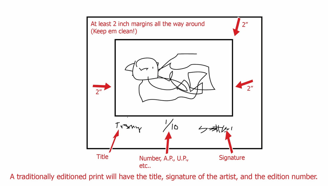
Your goal is to make 10 different artist's proofs of your print - using different colors and techniques of rolling the ink. (These will be on your working blog.)

then you will make an edition of 10 cards or just prints of the proof you like the best. (These will be on your grading blog.)

Monday we go back to painting.


Picture
<<Previous

    Ms. Heideman


    [email protected]

    Archives

    November 2021
    October 2021
    January 2018
    December 2017
    November 2017
    October 2017
    September 2017
    August 2017
    January 2016
    December 2015
    November 2015
    October 2015
    September 2015
    June 2015
    May 2015
    April 2015
    March 2015
    February 2015
    January 2015
    December 2014
    November 2014
    October 2014
    September 2014
    June 2014
    May 2014
    April 2014
    March 2014
    February 2014
    January 2014
    December 2013
    November 2013
    October 2013
    September 2013

    Categories

    All

    RSS Feed

Powered by Create your own unique website with customizable templates.