AHEIDEMANART.com
  • home
  • Ceramics
    • Ceramics daily blog >
      • ceramics clean up
    • Projects assigned >
      • project progress scales
    • ceramic videos >
      • video demos
      • Aheidemanart on youtube
    • Ceramics documents..
    • ceramics rubrics & scales
    • hand project still demos
  • 2D art
    • Drawing and painting blog
    • 2d class documents
    • drawing & painting tutorials
    • rubrics
    • 2-Dimensional scales
    • 2d assignments
    • extra credit in 2D
  • File Cabinet
    • philosophy of education
    • Course content
    • art elements
    • rules >
      • rules of the road
      • the fine print
      • Classroom covenant
    • Grading >
      • Work Log
      • project sheet
      • writing a paragraph
      • end of quarter self - evaluation
      • end of the SEMESTER evaluation
      • presentations learning targets
      • clean up ticket
    • Teamwork >
      • employablitity skills grading worksheet
    • scheduals >
      • bell scheudal
      • FINALS SCHEDUAL
      • afternoon assembly schedual
      • confrence shedual
    • substitute teacher info
    • what is ms. h like, anyway?
    • how to make a weebly site
  • Links
    • contact page
    • student blogs
    • advanced & AP 2013-14
    • link to model advanced page
    • link to 'vintage' site
  • Galleries
    • 2D gallery
    • Ceramics
    • Advanced ceramics
    • RAKU!
  • AP student info
  • tutorials
  • Ann talks
  • events!! Blog
  • festival of the arts entry form
  • ceramics club page
  • 2d gallery
  • 2 d gallery blog
  • scheduals
  • parent events
  • New Page

making a block print

11/30/2017


thing to remember always - the block is the opposite of what is printed.

-- the print will be a mirror image of the block.
-- you cut away the negative space to reveal the image.


see these posts.
https://letsmakeart.weebly.com/2d-assignments-for-all/making-your-first-block-print

https://letsmakeart.weebly.com/2d-assignments-for-all/december-18th-2014

your assignement is to make a small block print that can be used, if you like, for a holiday card.
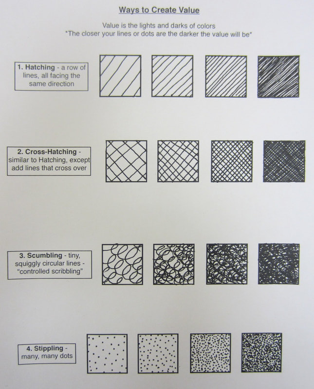
it needs to have an image and some writing. it needs to have three kinds of texture.
the image must be positive - you need to cut the negative space away. not the positive.

we want the image to be like on the right - not on the left. we are going to cut away the negative space so the lines are printed in ink.
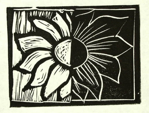
Picture

why are dip pens so different than other pens?

11/29/2017


Describe the structure of the pen nib itself? what is is like?

where does the ink go?

How do you have to draw with it?

how do you make changes in the line?

why is having different thickness of lines important?


Please finish your drawing today -- It will go on Your GRADING Blog.

pen and ink rubric

11/28/2017


 I can create a wide variety of value with texture of hatching, cross-hatching and stippling

the values describe the surface texture of the object(s) drawn as well as the light on the surface.

the subject takes up at least 70% of the page

create space by overlapping, relative size and value 

create a finished drawing

pen and ink

11/27/2017


What are the three ways to create texture and value with just black marks?

Is there another way?

++This ink drawing should be finished today and go on your
WORKING BLOG

our next assignment will be finished ink drawing of your choice
of
- your shoes
- a close up of a flower/plant
- your hand (or someone's hand from a photo)
It should be finished by the end of class Wednesday.

drawing in pen and ink

11/17/2017


today's assignment - using a dip pen, divide up  your page into different shapes. Make a different textured pattern in each. use hatching, cross hatching and stippling.

Picture

BUT first, let's find out about dip pens.

now let's find out about hatching, cross hatching and stippling.

Picture
Picture

November 16th, 2017

11/16/2017


​Keep your basic pigments in a circle of two or more colors  and drag some of each into the center to mix.

- always bring dark color to a light color to make a tint or shade

dark colors are more 'powerful' than light ones and can easily overwhelm the light color.

Picture

background color in a portrait

11/15/2017


The background color is often neutral unless you are trying to make some kind of statement in the work.

Picture

what color will your back ground be and why?

Picture
kehinde Wiley  2009

Without shying away from the complicated socio-political histories relevant to the world, Wiley’s figurative paintings and sculptures “quote historical sources and position young black men within the field of power.” His heroic paintings evoke a modern style instilling a unique and contemporary manner, awakening complex issues that many would prefer remain mute.

http://kehindewiley.com/​
Amy Sherald, They Call Me Redbone but I’d Rather Be Strawberry Shortcake, 2009

Sherald modifies historical portrait formats to upend the dominant narrative of African American history. She notes: “I create playful yet sober portraits of black Americans within an imaginative history where I do black my way, in the European tradition of painted portraiture.” While historical portraitists aimed to reveal a sitter’s social standing or some essence of character, Sherald’s haunting figures are expressionless and dressed in unusual, costume-style clothing that she has collected.

https://nmwa.org/works/they-call-me-redbone-i%E2%80%99d-rather-be-strawberry-shortcake​

what is the rubric for the portrait painting?

11/14/2017


I can accurately use proportion to create a convincing face - the background - or un-activated space will take up no more than 20% of the picture

I can create the illusion of three dimensions by using highlights, relative size, overlap and value 

I
start with light colors, building layers for deeper hues  to create a sense of luminosity of a living person


I can mix complementary colors for shadows and highlights - and not use tints and shades

I can
paint neatly -  starting with washes, waiting for the paint to dry and adding details in layers. I can make a complete painting with no pencil lines showing.


using complements for shadow in skin tone

11/13/2017


making shadows and highlights in portraits means using compliments in order to make the face look lively and give the skin luminescence. Try mixing orange/red and green or yellow/orange and blue to make 'browns' to make shadows.

Picture
Picture
Picture
Picture

starting our color portrait

11/9/2017


Why is tempera paint different than water color?

Tempera paint has a vehicle (water)  & pigment just like water color, however it also has something that carries the paint and makes it thicker. The sizing and binders make it opaque.

The main difference is you can paint some light over dark, because it is slightly opaque -- however darks cannot be completely covered easily.

traditionally  tempera paint was made with eggs, milk or some kind organic compounds that make it  thick -   "A paint consisting of pigment and glue size commonly used in the United States as poster paint is also often referred to as "tempera paint," although the binders and sizes in this paint are different from traditional tempera paint." wikipedia

<<Previous

    Ms. Heideman

    MSHS
    aheidemanart@gmail.com

    Archives

    January 2018
    December 2017
    November 2017
    October 2017
    September 2017
    August 2017
    January 2016
    December 2015
    November 2015
    October 2015
    September 2015
    June 2015
    May 2015
    April 2015
    March 2015
    February 2015
    January 2015
    December 2014
    November 2014
    October 2014
    September 2014
    June 2014
    May 2014
    April 2014
    March 2014
    February 2014
    January 2014
    December 2013
    November 2013
    October 2013
    September 2013

    Categories

    All

    RSS Feed

Proudly powered by Weebly