AHEIDEMANART.com
  • home
  • Ceramics
    • Ceramics daily blog >
      • ceramics clean up
    • Projects assigned >
      • project progress scales
    • ceramic videos >
      • video demos
      • Aheidemanart on youtube
    • Ceramics documents..
    • ceramics rubrics & scales
    • hand project still demos
  • 2D art
    • Drawing and painting blog
    • 2d class documents
    • drawing & painting tutorials
    • rubrics
    • 2-Dimensional scales
    • 2d assignments
    • extra credit in 2D
  • File Cabinet
    • philosophy of education
    • Course content
    • art elements
    • rules >
      • rules of the road
      • the fine print
      • Classroom covenant
    • Grading >
      • Work Log
      • project sheet
      • writing a paragraph
      • end of quarter self - evaluation
      • end of the SEMESTER evaluation
      • presentations learning targets
      • clean up ticket
    • Teamwork >
      • employablitity skills grading worksheet
    • scheduals >
      • bell scheudal
      • FINALS SCHEDUAL
      • afternoon assembly schedual
      • confrence shedual
    • substitute teacher info
    • what is ms. h like, anyway?
    • how to make a weebly site
  • Links
    • contact page
    • student blogs
    • advanced & AP 2013-14
    • link to model advanced page
    • link to 'vintage' site
  • Galleries
    • 2D gallery
    • Ceramics
    • Advanced ceramics
    • RAKU!
  • AP student info
  • tutorials
  • Ann talks
  • events!! Blog
  • festival of the arts entry form
  • ceramics club page
  • 2d gallery
  • 2 d gallery blog
  • scheduals
  • parent events
  • New Page

Drawing an optical illusion with warm and cool complimentary colors.

11/8/2021


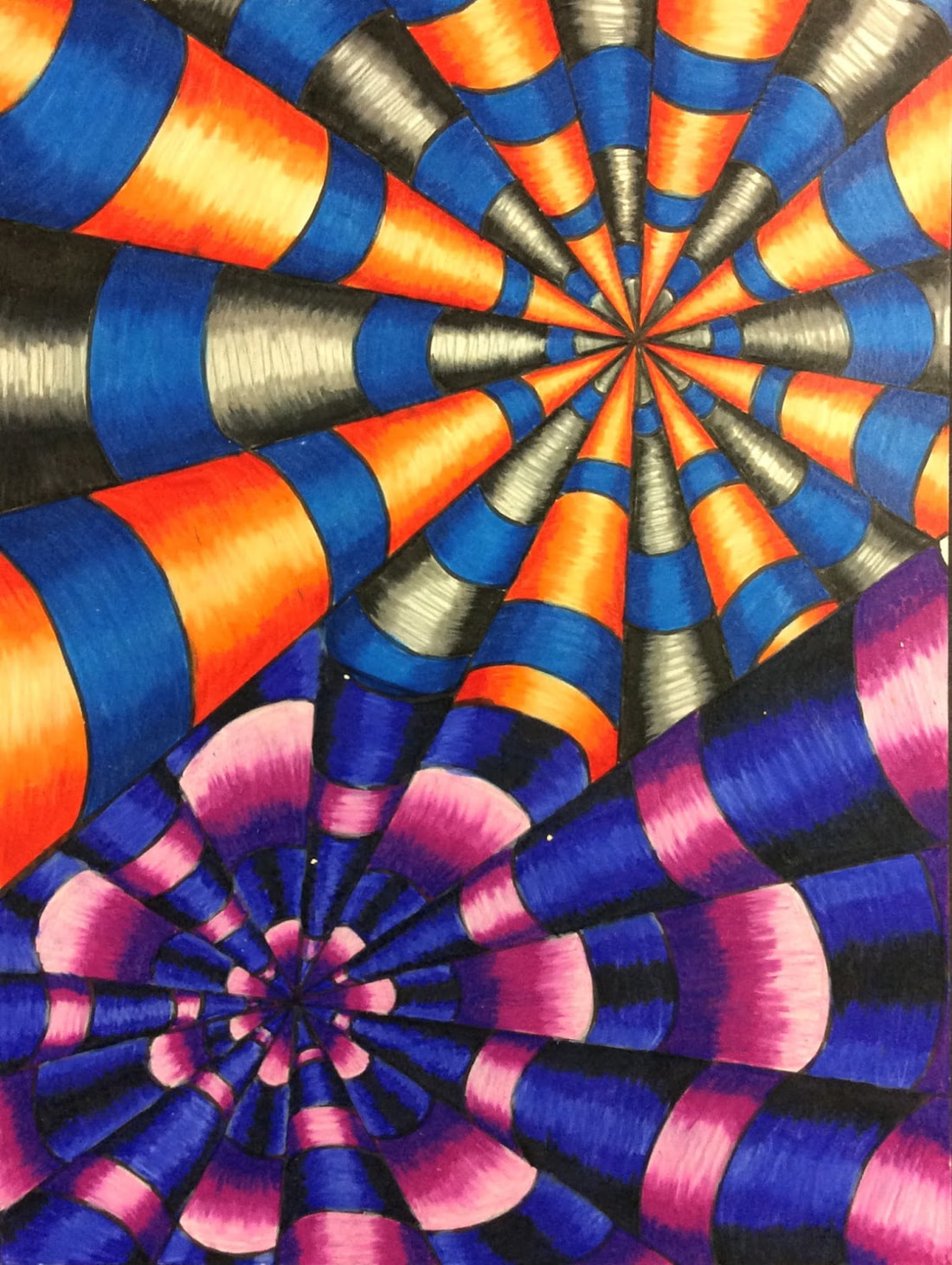
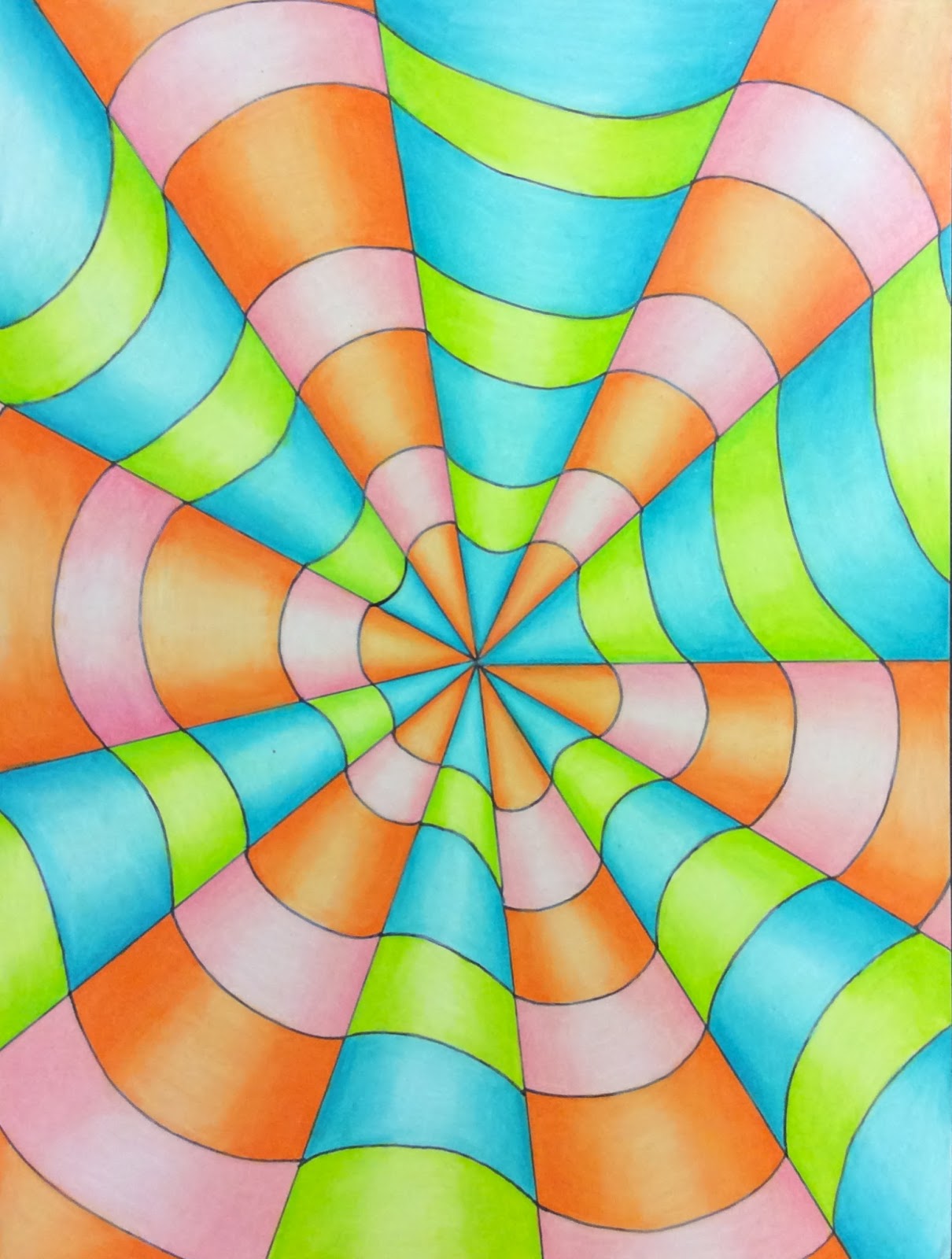
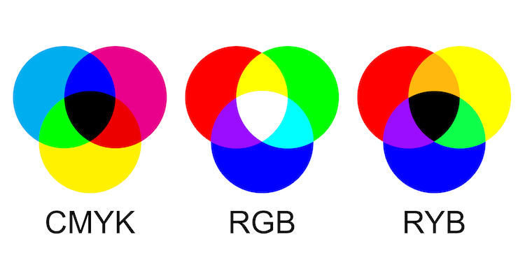
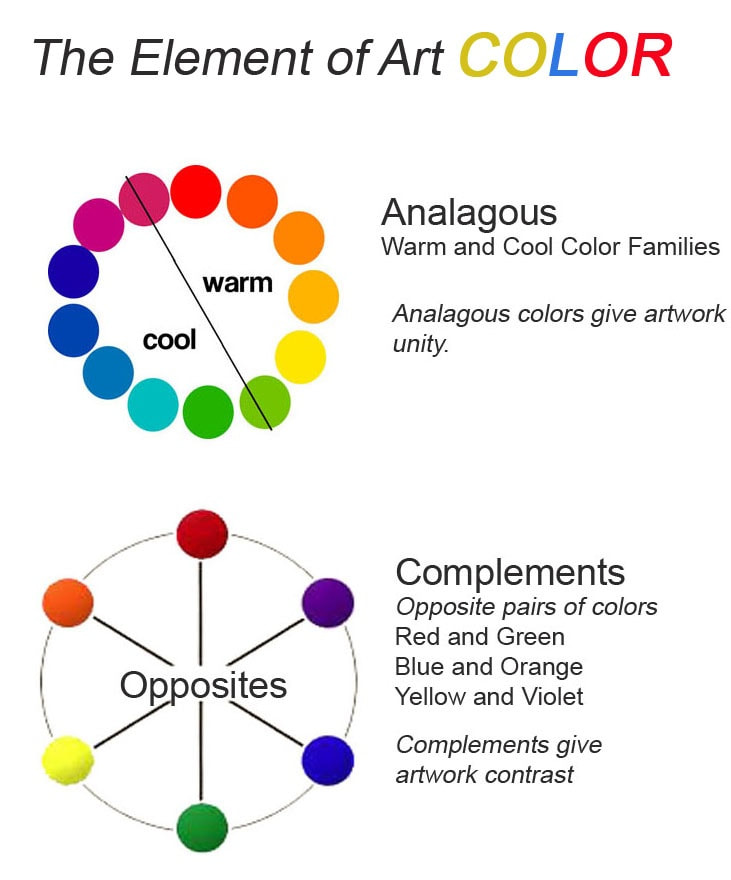
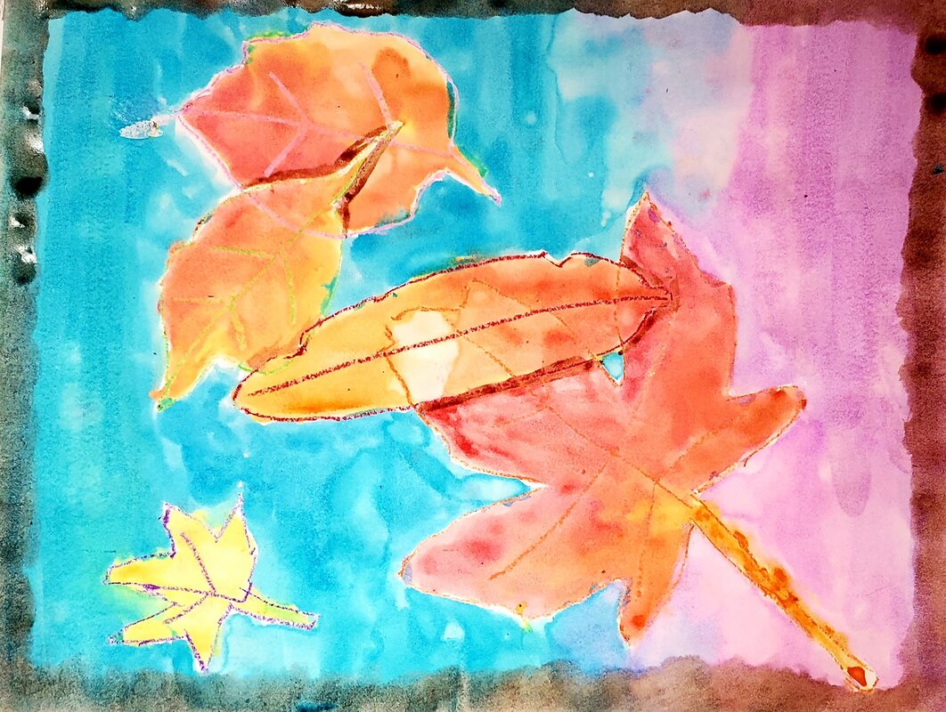
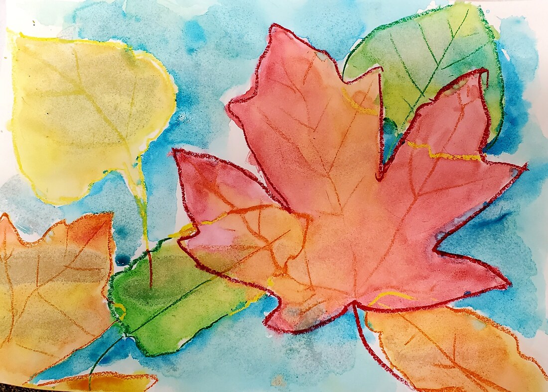
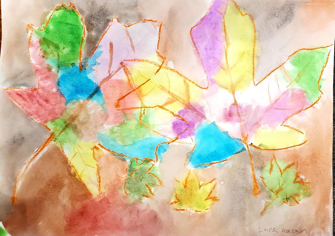
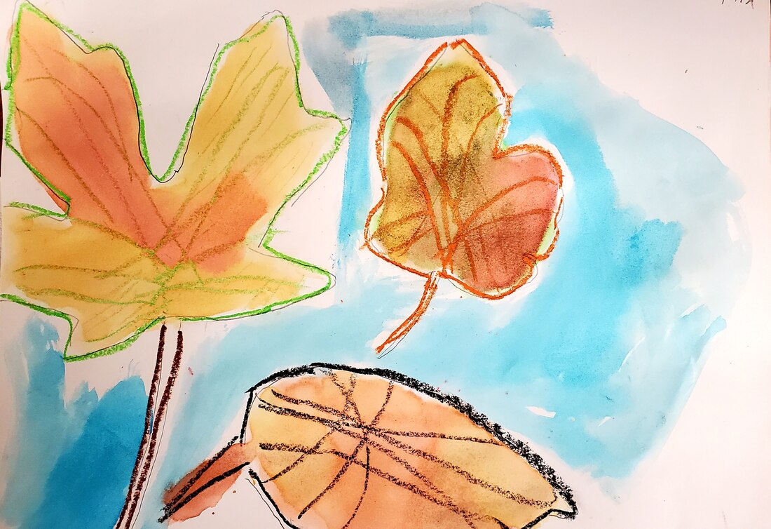
 Using the art elements of color - we remember colors are
warm (yellow, orange, red) or cool (purple, blue, green)
we also remember that colors on opposite sides of the color wheel are compliments. We want to add the art element of SPACE and the design element of MOVEMENT to make a drawing that creates the illusion of moving in space!

When we shade a color and want it to look round - we make it dark at the edges - where it recedes - and light on the surface closest to us like a refection.
​
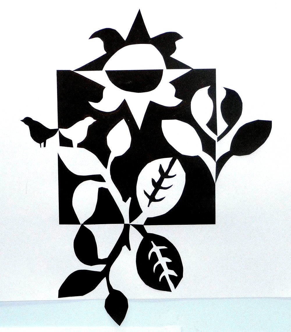
Can you see the difference between the two drawings here? What are four ways they are different? Are there more than four ways they are different?

Picture
Picture

1. one has two centers. 2. the right one has more pronounced highlights. 3. the right one has lines that curve two directions. 4. The color plans are different. Can you describe them? Do you notice that both have alternative stripes?

So our goals are to -

- Use line to create an optical illusion.

- Group together warm and cool colors.
- Use shading to create form within the line composition.
we won't use a sharpie, a pencil works just fine, but you can watch the video to see the instructions. We will use colored pencils for the color. Remember to color dark at the edge and light at the the center. 
Watch the video and then we'll try it together.

Using Shape and Color to make Pattern

11/1/2021


Pattern is a Design Element. 

We use words to make a sentence in the same way we use
art elements to make design elements.

So today we will use repeated shapes and colors to make a pattern. That's what a pattern is - repeated art elements.

Picture

A tessellation is a specific kind of patterns where shapes fit together with no space in between. It is also called tilling because it like a tile floor. But you can see the 'tiles' don't have to be squares - can you find the basic shape here that 'tiles'?

We are going to do some tessellating patterns by cutting up a square into a new shape and then tracing it so as to make a tiled pattern - and then coloring it.

Picture
Picture

Picture

Be sure to grid off your paper with squares lightly in pencil before you cut, tape and trace. As you can see from the images below that will make them fit on the paper.

Picture
Picture

Using color

10/25/2021


Color is the next art element. 
We can talk about color in a few ways.

​Primary colors - and how they mix. Notice colors on a screen are different than with paint. Paint uses pigments - not light waves.

Picture

colors across from each other on the color wheel are called compliments and they make each other seem brighter when next to each other. so for a bright painting you want some compliments.

Colors also are considered Warm or Cool.

Picture

Using water color and crayons - you can draw the leaves or trace them. Make sure to have a group that overlaps. 

When you the add color - start with the lightest colors first - yellow. Wait till the end to add the darkest darks. With the water colors let the colors run into each other. Paint the back ground last.

Picture
Picture
Here are some done in Class in the P3 program October 2021
Picture
Picture
Picture
Picture

Notan Squares

10/11/2021


​Notan is the Japanese word that means the use of light and dark

Picture

In this assignment we will use the first two art elements - line and shape. 

Some ideas/words to know - 
Positive Space and Negative space.

Picture
Positive shapes occupy positive space.

The area around positive shapes, the background, is negative space. A solid piece of sculpture occupies space, and makes the space around it come to life. In fact, sculptors think of the entire composition, the interplay between solid and space, when they create a work of art.

​In this diagram, the negative shapes are as clear and distinct as the positive shapes. occupy positive space. The area around positive shapes, the background, is negative space. A solid piece of sculpture occupies space, and makes the space around it come to life. In fact, sculptors think of the entire composition, the interplay between solid and space, when they create a work of art. In this diagram, the negative shapes are as clear and distinct as the positive shapes.

Another thing to think about is the difference between symmetry and asymmetry.

Picture

So now -

Picture

We are going to start with a small black square and make a pattern with leaf motifs. Start with a practice small one and then we might move on to a larger one.

Picture

October 04th, 2021

10/4/2021


Last Day of First Semester !!!!

1/12/2018


Make sure I see or your post your last two paintings.

Please take down your art work from the Hall.

Show me your clean locker. If you are returning, Please make sure it is clearly marked so fourth period does not 'dump' your stuff.
Clean means - no art materials and only one or two things you are working on now. Also it means washed out!

​Period 2                8:20-9:00
Period 3                9:05-9:40
Period 4                9:45-10:20 
  Period 5         10:25-11:35            
1
st lunch     10:20-10:50
               
2
nd lunch              11:05-11:35

Period 6                11:40-12:19

Our last days to paint. Jan 10-11

1/10/2018


please finish your 'Disney choice' and 'Dream-time' today and Thursday.

Friday is clean up day. so much fun!!

You do not need a paragraph for these art works on your grading blog

Make sure your locker is cleaned out.


Thursday, January 11

Pd 2  8:25-9:05 40 Minutes

Pd 3  9:10-9:50 40 Minutes

Pd 4  9:55-11:05 
 
Class w/ 2nd Lunch  9:55-10:35 40 Minutes 
2nd Lunch 10:35-11:05

Class w/ 1st Lunch  10:25-11:05 40 Minutes  
1st Lunch 9:50-10:20

Pd 5 - Final  11:10-12:35 85 Minutes
Break  12:35-12:45 10 Minutes
Pd 6 - Final  12:50-2:19 89 Minutes
Lunches based on 4th period

Tuesday's final --

1/9/2018


Please turn in your packet to basket.

take a few minutes to prepare your presentation -- see yellow sheet. Use the back, as well as another sheet of paper (they won't all fit otherwise) to take notes on other presentations. Again, this is for your written final grade.

Please use the rest of the period -- if we have time -- to finish cleaning out your locker except for Dream-time, which we can finish Weds and Thursday.

Monday - final is tomorrow

1/8/2018


Make sure you have your final packet when you come into class tomorrow.

LINK HERE For instructions. Purple sheet should be in box by door -- also available on this link. (note 'purple sheet is Rubric)

Please spend today finishing your work. You must have posted up through the personal Disney painting by tomorrow.

Dream time can be worked on on Wednesday and Thursday.

Please start to take things home, lockers cleaned out Thursday.

Jan. 3 - Jan 5  (Wednesday - Friday)

1/3/2018


Please finish your personal "Disney" painting --

next up -- please work on this Through Monday, Jan. 8th. I will not require a paragraph for it, but would like the picture posted.  I will be collecting these paintings.

​What is Dreamtime? follow this link and read about it. 

Follow this link to read about your new assignment. Since we don't have a lot of time to finish it, you can make it smaller -
make it half the usual 18"x 24" paper, it should be - 9" x 12"
You can use tempera or try acrylic.  Try using Q-tips to make the dots.  DO NOT draw it out first -- let it be spontaneous and take its own path. please follow link above to see assignment
​and read rubric here

<<Previous

    Ms. Heideman


    [email protected]

    Archives

    November 2021
    October 2021
    January 2018
    December 2017
    November 2017
    October 2017
    September 2017
    August 2017
    January 2016
    December 2015
    November 2015
    October 2015
    September 2015
    June 2015
    May 2015
    April 2015
    March 2015
    February 2015
    January 2015
    December 2014
    November 2014
    October 2014
    September 2014
    June 2014
    May 2014
    April 2014
    March 2014
    February 2014
    January 2014
    December 2013
    November 2013
    October 2013
    September 2013

    Categories

    All

    RSS Feed

Powered by Create your own unique website with customizable templates.